Is The Nothing Phone (1) really just all hype?
As regular viewers know, I’ve basically used an iPhone and the whole Apple ecosystem since the very first iPhone came out, but I keep seeing my Android friends wave around their phones with features us iPhone users can only dream of.
Over the last few weeks, I’ve been putting the Nothing Phone through its paces in my quest to switch away from iPhone to Android.
So after 2 weeks with the Nothing Phone (1) - here are the good things, and the bad things about this phone, and why I actually think this phone is one of the best phones to get if you are switching from an iPhone.
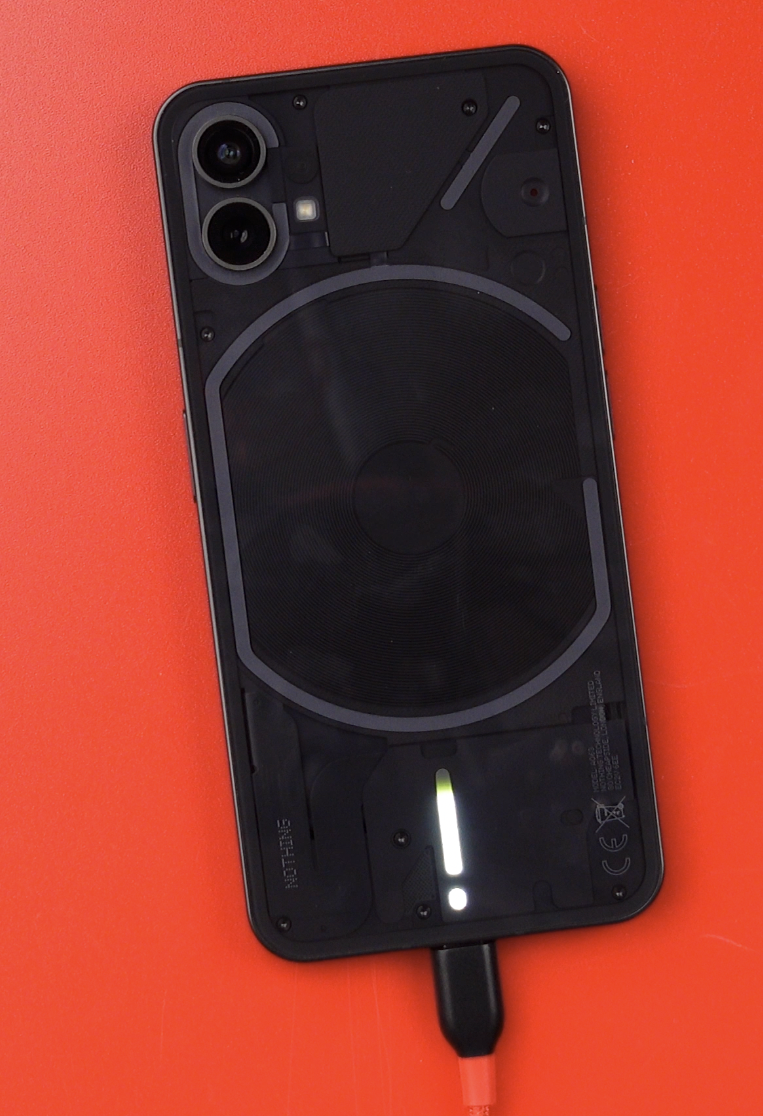
Design
First, let’s talk about the design - because this phone is the most Apple-like Android phone that I have ever used.
From the placement of the Power and the volume buttons, to where the under-screen fingerprint reader is positioned… Even the design with the flat edges, flat screen and dark antennae bands are the same!
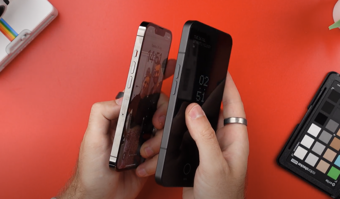
Even the circle around the fingerprint sensor looks just like it’s a Touch ID Sensor.
In fact, I’d hazard a guess that most people would see this lying down on a table, and know that it’s an iPhone. Not think - KNOW.
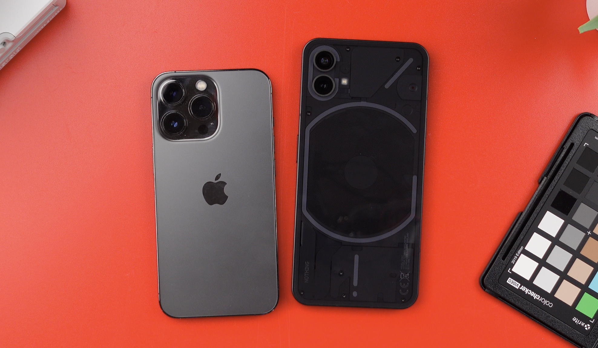
And this familiar design is actually a good thing, there’s a reason why Apple has stuck with pretty much the same design for the last decade - it just works.
So picking this phone up and using it, knowing to reach for the Touch ID sensor and taking screenshots by holding the power and volume buttons down, all provide a very familiar experience.
Flagship Features
But whilst it’s familiar, it of course has all the benefits of switching to Android with those unique features that we don’t see on iPhone.
Features like the Always On Display and the ability to customise practically anything.
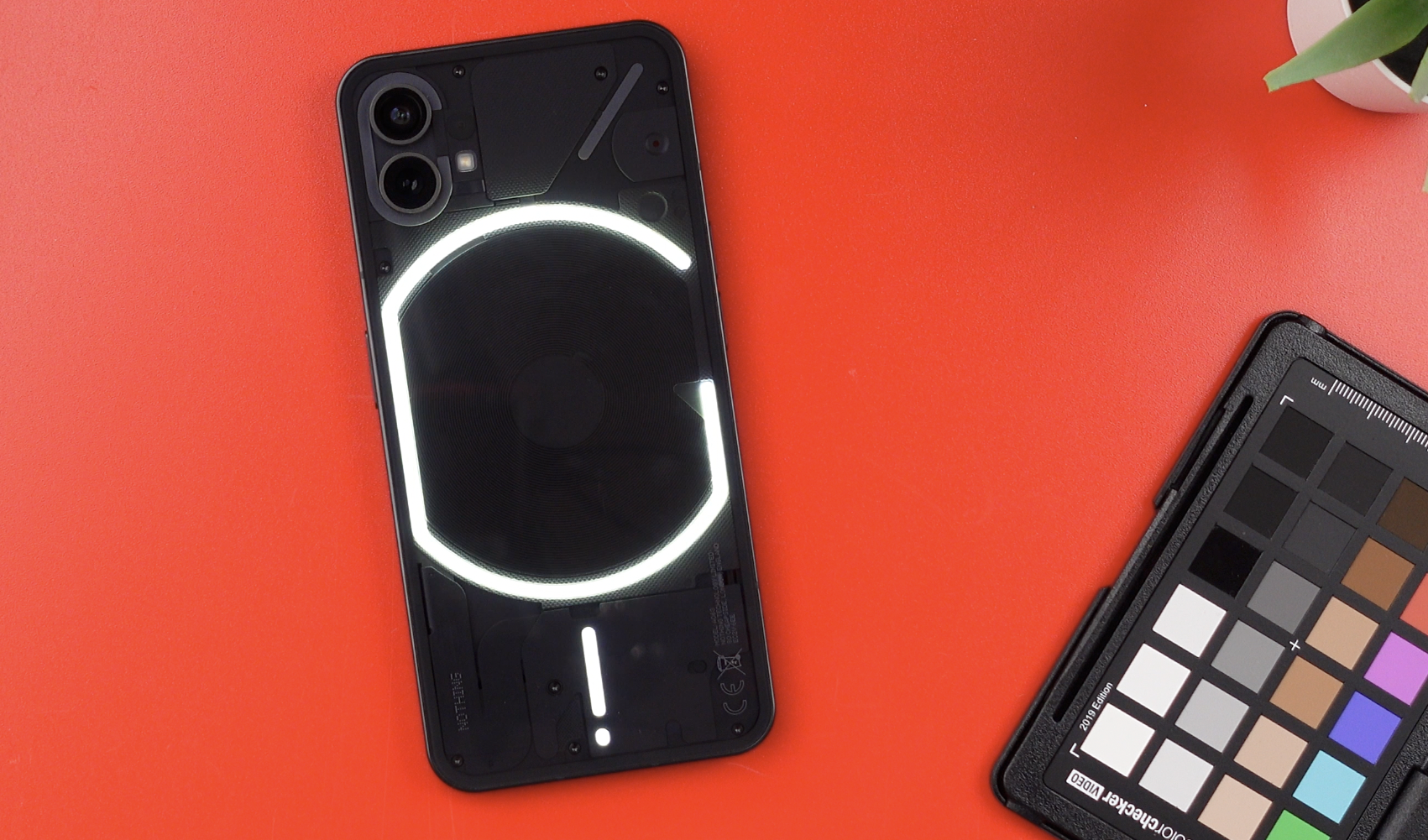
And then there’s the Glyph system, which is the Nothing Phones party trick.
I tend to find every phone has one.
With Google, we have the Tensor chip with all of the AI Voice features that bring. The S22 Ultra and its S-Pen and 100x Zoom, the POCOs and their 100+ watt charging.
So over here with the Nothing Phone, we have the Glyph System - which is a series of lights on the back of the phone which can light up as a way of notifying you of notifications, messages and phone calls.
And this is really cool looking! It’s really well designed, and the settings behind the scenes are also pretty well thought out - It definitely stands out from the rest of the Android phones as being very different.
As it currently stands, you can choose from around 10 preset ringtones and notification sounds with more to come, but the Glyph system also does more than just this.
When you charge your phone, for example, it can be used as a progress indicator to how full your phone is.
You can use a feature dubbed Flip to Glyph to silence your phone when you place it face down and just use the Glyph to alert you to notifications.
And you can even use it as a bit of a fill light when shooting video which does a reasonable job, but only when shooting in very dark environments, or you’ll need to switch to the separate fully featured flash.
There’s also an old-school red LED that flashes whilst recording for that true retro video camera feel, which is good when someone else is filming you (but not so good if you want to secretly record something?)
Problems with the Glyph System
So whilst I really love how this looks, I think it’s really unique and does make the phone stand out - the Glyph system also has a problem.
You see, firstly - you have to turn your phone over. Which means potentially scratching the glass. Not a great start.
But mainly, by flipping the phone over, you then can’t see what the notification is.
That issue is compounded further because the lights trigger on pretty much everything, and there is no current way to configure which apps trigger the notifications.
A tweet, a text message, being tagged on Facebook, an email, all of those things will flash the LEDs on the back, and unless you flip the phone over, you can’t tell one from another. Not yet anyway.
Nothing’s Camera
The cameras are OK, verging onto Pretty good. (Which, to be honest, is a decent rating for a £400 phone!)
If anything, it seems to over-saturate the greens and yellows in some images but otherwise, on first glance, the camera looks good to me.

The Nothing Phone looks OK on the face of it - but when you look a little closer you can see that at least for this photo, the Nothing Phone has totally missed pulling the hair into focus.
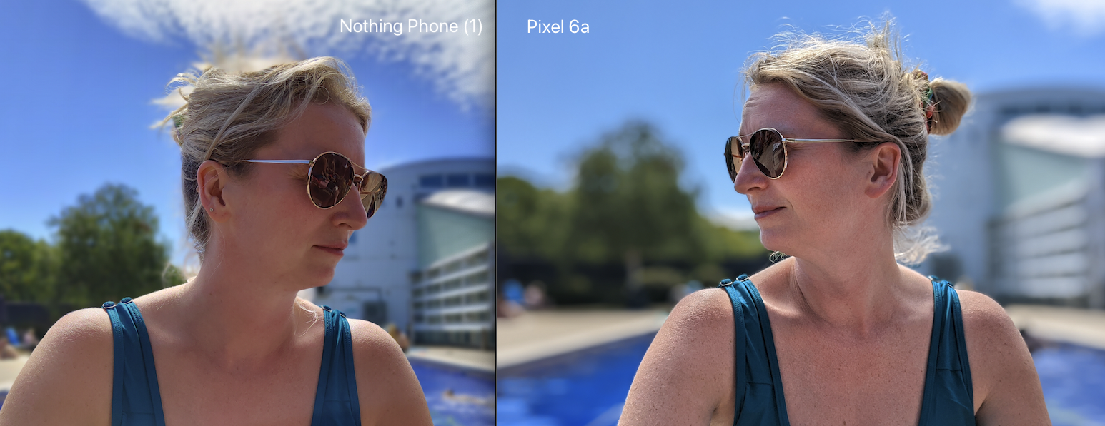
Then you look at other photos and you can see the colours on the Nothing, to me, look more accurate to me. The Pixel just seems to over-sharpen and really over-saturate pretty much all of the photos.
On the selfie camera, the Pixel gives a better and more accurate image over the Nothing. You can see that whilst the Pixel is possibly over-sharpening, the Nothing seems to have this beauty filter thing baked into it which smooths the skin out, which in some images can look a bit unnatural. And I can’t find any way of adjusting or switching this off anywhere in the settings.
Overall, and for the price point of the phone - I don’t think it’s a bad camera. It’s just… OK.
Performance
Overall performance of the phone is also pretty good. Day to day it’s been snappy, with no noticeable slowdowns except a few times a day where I just have to wait for the keyboard to appear before I can do anything - but I get the feeling that this is again more software issue than a hardware issue.
And speaking of software issues - a strange thing about the Nothing Launcher I found when switching the grid on how many icons you can fit on the screen at any one time, it just totally blitzes your home screen and you have to start from a literal blank canvas.
Nothing Tesla Integration (Beta)
Something else that really intrigued me about the nothing phone 1, was when they made a comment about integration with Tesla. It made it sound like they were working closely with Tesla to develop this feature that allows you to control your Tesla directly in the notification shade.
Which, as far as my testing goes, is just nonsense.
Once you hook it up to your Tesla account, you then tap on the icon and then you’ll get access to the controls.
Which, is actually more steps than is required on even the Pixel 6a, where you can literally tap those commands on the notification shade without any additional taps.
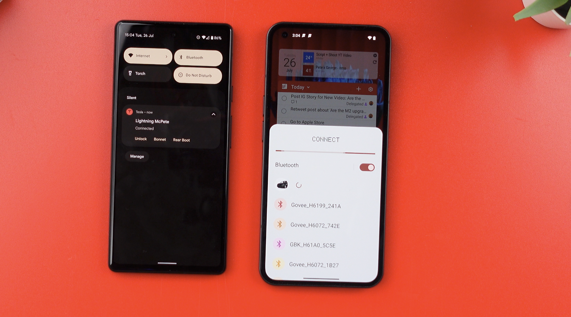
Yes perhaps Nothing’s integration may look a little nicer, and perhaps you will be able to customise which buttons you see in the future, but for me, the default Android way works just as well, if not better than how Nothing’s version currently works.
Battery Life
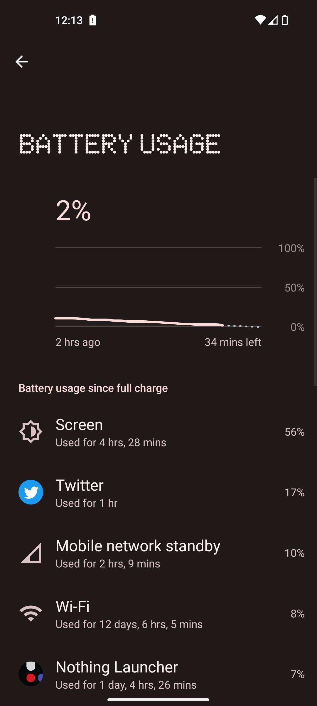
Battery life on the Nothing phone has also been actually, pretty good so far! I’ve seen 4 1/2 to 5 hours of screen on time on this phone - which for me has been good enough to get me through a full day of using this phone. And actually, I even got through 2 days on a single charge, so much so that it made me wonder if the phone was actually calculating the screen on time properly because this screenshot of 4 1/2 hours of screen on time was from 2 FULL days of using it…
Pros vs Cons
Overall, we’ve got a very well-put-together 120hz display, which looks great, at 1200 nits peak brightness it’s better than the iPhone, but not as good as the flagship S22 Ultra - but again for a budget phone, that’s pretty incredible.
You’ve also got a fingerprint sensor that actually works well when you compare it to the Google Pixel range of phones.
There’s also a lot to be said about how well this phone has been put together - from no bloatware installed, (there’s no Nothing version of your mail, browser, photos, LinkedIn or other apps pre-installed) and Nothing’s version of Android here is so clean that the interface does absolutely fly.
It’s a really smooth implementation that does feel like a nice experience, particularly as an iPhone user. It’s got all that familiarity of the form factor, but with a very well-put-together Android experience.
If there was one thing which I feel lets this phone down, is the fact that this phone is missing an IP rating.
I mean, this phone has an IP53 rating, but not a rating of IP67 or 68 that most other phones nowadays have. Even the Pixel 6a, which is practically the same price as the Nothing phone is IP67 rated.
With the IP53 rating, you’ll get away with using it out in the rain, but not fully submerged. So if you plan on taking this with you into the sea, swimming pool or hot tub, or for your holidays in anywhere that it could accidentally get dropped in water - then this isn’t the phone for you.
Which is a shame given the rest of the decent specs and features that you’ll get with this phone.
And if you are thinking of leaving your iPhone for Android, and particularly switching from one with a TouchID button at the bottom - then the Nothing phone is a great candidate for you. And your wallet will be grateful to you too!


